A Flutter package that floats any widget above your content and reacts to scrolling. Use it as a tab bar, bottom navigation bar, search bar, or any custom child.


 |
 |
 |
|---|---|---|
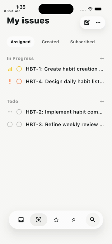
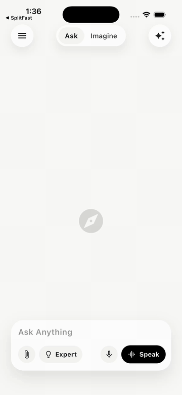
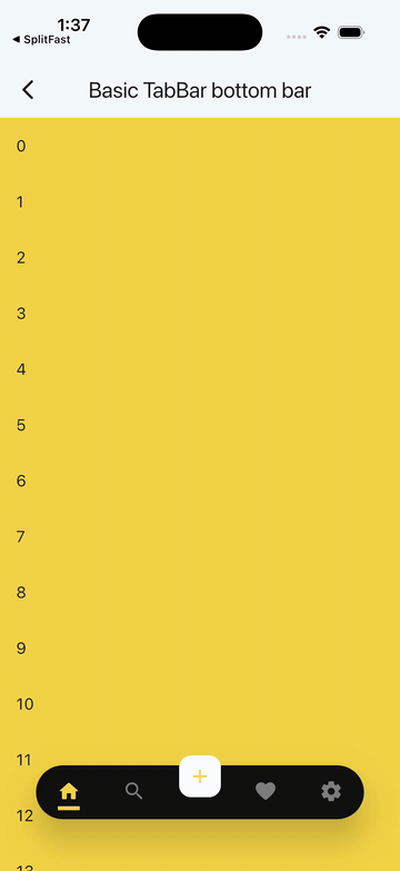
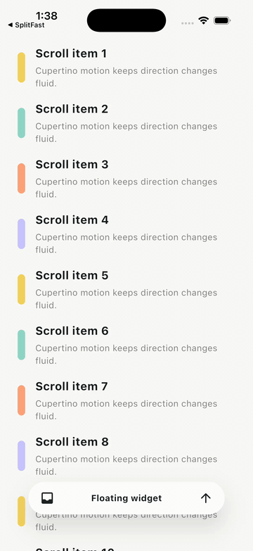
| Issues dock | AI prompt dock | Basic TabBar |
 |
 |
 |
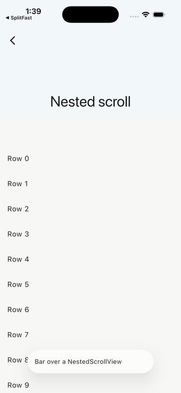
| Minimal API | Nested scroll | Badged nav |
 |
||
| Custom transition |
flutter_floating_bottom_bar v2.0.0 is a floating widget host that sits above your scrollable content and responds to scroll events automatically — no ScrollController wiring required.
- Host anything: pass a
TabBar, search bar, customRow, orBottomBarItemswidget as the floatingchild. - Notification-based scroll detection: the bar listens to
ScrollNotificationfrom any descendant scrollable in the body subtree —NestedScrollView, multi-TabBarView,CustomScrollView, and user-supplied controllers all work out of the box. - Material 3 themed defaults:
barDecorationdefaults tocolorScheme.surfaceContainer;iconDecorationdefaults tocolorScheme.primary. No more hardcodedColors.black. - Optional helpers:
BottomBarItemandBottomBarItemsmake the common nav-item case (icon, label, badge, selection) easy without turning the package into a full navigation widget. - Cupertino motion by default: show/hide is now backed by Motor springs, so changing scroll direction mid-animation redirects velocity instead of snapping to a new curve.
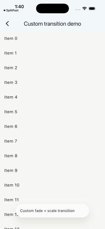
- Custom transitions: choose from built-in
BottomBarTransitionenum values (slide,fade,scale,slideAndFade) or supply your owntransitionBuilder. - Config objects: flat constructor parameters from v1 are grouped into
BottomBarLayout,BottomBarMotion, andBottomBarScrollBehaviorfor better readability and app-wide theming viaBottomBarThemeData.
If you use Claude Code, there's a skill that can integrate, replace, migrate, and debug this package for you — no manual API-reading required.
What the skill does:
- Replaces an existing
BottomNavigationBar,NavigationBar,BottomAppBar, or third-party nav bar (salomon, GNav, convex…) with a floating bar - Migrates v1.x code to v2.0 (config objects, new scroll behavior, motion API)
- Picks sensible motion defaults (Cupertino spring) and surfaces alternatives
- Fixes common glitches: content clipped behind the bar, jumpy spring,
NestedScrollViewnot triggering hide, custom transition overshoot
Install the skill:
/install-skill https://raw.githubusercontent.com/codenameakshay/flutter-floating-bottom-bar/main/.claude/skills/flutter-floating-bottom-bar.skillThen just describe what you want — paste your existing bottom bar code, say what feel you're after, and the skill handles the rest.
Requires Dart >=3.5.0 and Flutter >=3.22.0.
Add to your pubspec.yaml:
dependencies:
  flutter_floating_bottom_bar: ^2.0.0
Or use the Flutter CLI:
flutter pub add flutter_floating_bottom_barThen import:
import 'package:flutter_floating_bottom_bar/flutter_floating_bottom_bar.dart';BottomBar(
layout: BottomBarLayout(
width: 280,
borderRadius: BorderRadius.circular(28),
),
body: ListView.builder(
itemCount: 200,
itemBuilder: (_, i) => ListTile(title: Text('Item $i')),
),
child: const Padding(
padding: EdgeInsets.all(16),
child: Text('This is the floating widget'),
),
)BottomBar requires exactly two arguments: child (the floating widget) and body (the scrollable content beneath it). No ScrollController needs to be passed; the bar observes ScrollNotification automatically.
v2.0.0 is a major release with breaking changes. Here's how to migrate from v1.x:
| v1.x | v2.0 | Migration |
|---|---|---|
body: (context, controller) => Widget |
body: Widget |
Drop the builder; the bar listens to scroll notifications. Pass your own ScrollController into your scrollable directly if you need one. |
barColor |
removed | Use BottomBarThemeData.barDecoration or the theme: argument. |
width, offset, borderRadius, barAlignment, fit, clip, respectSafeArea |
BottomBarLayout |
Wrap into layout: BottomBarLayout(...). barAlignment → alignment. |
duration, curve, start, end |
BottomBarMotion |
BottomBarMotion() now defaults to Cupertino spring motion. Existing BottomBarMotion(duration: ..., curve: ...) calls keep curve-based behavior. start/end (doubles) → slideStart/slideEnd (Offsets). |
hideOnScroll, reverse, scrollOpposite, scrollDeltaThreshold |
BottomBarScrollBehavior |
Wrap into scrollBehavior: BottomBarScrollBehavior(...). scrollDeltaThreshold → deltaThreshold. |
iconWidth, iconHeight, iconDecoration, barDecoration |
BottomBarThemeData |
Move to theme. Per-instance overrides remain via the theme: argument. |
BottomBarScrollControllerProvider |
BottomBarScope |
Renamed. The scrollController field is gone. New fields: barHeight, isVisible. |
No compatibility shim ships with v2.
The minimal setup — see the Basic usage section above.
The full runnable demo is at example/lib/demos/basic_demo.dart.
Wrap a TabBar (with an optional overlapping FloatingActionButton) as the floating child. Pass the TabBarView as body.
BottomBar(
  layout: BottomBarLayout(
    width: MediaQuery.of(context).size.width * 0.8,
    borderRadius: BorderRadius.circular(500),
    fit: StackFit.expand,
    clip: Clip.none,
  ),
  motion: const BottomBarMotion.cupertino(
    preset: BottomBarCupertinoMotion.snappy,
    duration: Duration(milliseconds: 460),
    slideStart: Offset(0, 3),
  ),
  scrollBehavior: const BottomBarScrollBehavior(hideOnScroll: true),
  theme: BottomBarThemeData(
    barDecoration: BoxDecoration(
      color: Colors.blue,
      borderRadius: BorderRadius.circular(500),
    ),
  ),
  body: TabBarView(controller: tabController, children: pages),
  child: Stack(
    alignment: Alignment.center,
    clipBehavior: Clip.none,
    children: [
      TabBar(controller: tabController, tabs: tabs),
      Positioned(
        top: -20,
        child: FloatingActionButton(onPressed: () {}, child: const Icon(Icons.add)),
      ),
    ],
  ),
)
See example/lib/demos/tab_bar_demo.dart for the full color-driven demo.
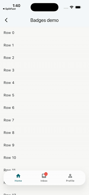
Use BottomBarItems + BottomBarItem for a ready-made icon/label/badge row without writing layout code:
BottomBar(
  layout: BottomBarLayout(
    width: MediaQuery.of(context).size.width - 32,
    borderRadius: BorderRadius.circular(28),
  ),
  body: ListView.builder(
    itemCount: 200,
    itemBuilder: (_, i) => ListTile(title: Text('Row $i')),
  ),
  child: Padding(
    padding: const EdgeInsets.symmetric(horizontal: 8, vertical: 8),
    child: BottomBarItems(
      children: [
        BottomBarItem(
          icon: const Icon(Icons.home_outlined),
          selectedIcon: const Icon(Icons.home),
          label: const Text('Home'),
          selected: _index == 0,
          onTap: () => setState(() => _index = 0),
        ),
        BottomBarItem(
          icon: const Icon(Icons.inbox_outlined),
          selectedIcon: const Icon(Icons.inbox),
          label: const Text('Inbox'),
          badge: Badge(label: const Text('3')),
          selected: _index == 1,
          onTap: () => setState(() => _index = 1),
        ),
      ],
    ),
  ),
)
See example/lib/demos/badges_demo.dart for the full runnable version.
For the full recipe catalogue, see EXAMPLES.md. Each recipe has a runnable counterpart in example/lib/demos/.
The root widget. Requires child and body.
| Parameter | Type | Default | Description |
|---|---|---|---|
child |
Widget |
required | The floating widget shown above body. |
body |
Widget |
required | The content beneath the bar. Any descendant scrollable drives hide/show via notifications. |
controller |
BottomBarController? |
null |
Optional imperative controller for show(), hide(), toggle(), scroll actions. |
layout |
BottomBarLayout |
BottomBarLayout() |
Size, radius, alignment, and stack configuration. |
motion |
BottomBarMotion |
BottomBarMotion() |
Motion engine, transition type, and slide offsets. |
scrollBehavior |
BottomBarScrollBehavior |
BottomBarScrollBehavior() |
Scroll-detection thresholds and direction flags. |
theme |
BottomBarThemeData? |
null |
Per-instance decoration overrides. Higher precedence than Theme.of(context).extension. |
icon |
BackToTopIconBuilder? |
null |
Builder for the back-to-top icon shown when the bar is hidden. |
showIcon |
bool |
true |
Whether to show the back-to-top icon. |
iconSemanticLabel |
String? |
null |
Semantic label for the back-to-top icon. |
iconTooltip |
String? |
null |
Tooltip for the back-to-top icon. |
onVisibilityChanged |
ValueChanged<bool>? |
null |
Called whenever bar visibility changes. true = now visible. |
onBottomBarShown |
VoidCallback? |
null |
Called when the bar becomes visible. |
onBottomBarHidden |
VoidCallback? |
null |
Called when the bar becomes hidden. |
Controls the bar's size, shape, position, and stack behavior.
| Field | Type | Default | Description |
|---|---|---|---|
width |
double |
300 |
Width of the floating bar in logical pixels. |
offset |
double |
10 |
Padding from the bottom and sides of the screen. |
borderRadius |
BorderRadius |
BorderRadius.zero |
Corner radius of the bar. |
iconOffset |
Offset |
Offset.zero |
Extra translation applied only to the back-to-top icon, e.g. Offset(0, 10) moves it 10px lower. |
alignment |
Alignment |
Alignment.bottomCenter |
Alignment of the bar within the stack. |
fit |
StackFit |
StackFit.loose |
fit passed to the underlying Stack. |
clip |
Clip |
Clip.hardEdge |
clipBehavior of the underlying Stack. Set to Clip.none for a FAB notch. |
respectSafeArea |
bool |
true |
Whether the bar respects system safe-area insets (e.g. iOS home indicator). |
Controls how the bar animates in and out.
| Field | Type | Default | Description |
|---|---|---|---|
mode |
BottomBarMotionMode |
cupertino |
Motion engine: Cupertino spring, curved, or raw Motor motion. |
cupertinoPreset |
BottomBarCupertinoMotion |
snappy |
Cupertino preset used by the default spring mode. |
duration |
Duration |
Duration(milliseconds: 500) |
Estimated spring duration, or fixed duration for curve mode. |
curve |
Curve |
Curves.easeOutCubic |
Curve used by BottomBarMotion.curved and legacy duration/curve constructor calls. |
transition |
BottomBarTransition |
BottomBarTransition.slide |
Built-in transition type. |
transitionBuilder |
Widget Function(BuildContext, Animation<double>, Widget)? |
null |
Custom transition. When non-null, overrides transition; spring progress can overshoot, so clamp opacity/size if needed. |
slideStart |
Offset |
Offset(0, 2) |
Starting offset for slide / slideAndFade transitions. |
slideEnd |
Offset |
Offset.zero |
Ending offset for slide / slideAndFade transitions. |
// Default: Motor-backed Cupertino spring, velocity-preserving redirection.
const BottomBarMotion();

// Cupertino presets.
const BottomBarMotion.cupertino(
  preset: BottomBarCupertinoMotion.bouncy,
  extraBounce: 0.04,
);

// Traditional deterministic duration + curve motion.
const BottomBarMotion.curved(
  duration: Duration(milliseconds: 280),
  curve: Curves.easeOutCubic,
);

// Any Motor motion, re-exported by this package.
const BottomBarMotion.motor(
  Motion.snappySpring(),
);
BottomBarTransition enum values:
| Value | Effect |
|---|---|
slide |
SlideTransition from slideStart to slideEnd. |
fade |
FadeTransition. |
scale |
ScaleTransition. |
slideAndFade |
SlideTransition composed with FadeTransition. |
Controls how the bar reacts to scroll events.
| Field | Type | Default | Description |
|---|---|---|---|
hideOnScroll |
bool |
true |
When false, scroll events never hide the bar (imperative controller.hide() still works). |
reverse |
bool |
false |
When true, the bar hides on upward scroll and shows on downward scroll (inverted). |
scrollOpposite |
bool |
false |
When true, the back-to-top icon scrolls to the end instead of the start. |
deltaThreshold |
double |
8 |
Minimum scroll delta (in pixels) required to trigger a visibility change. |
predicate |
bool Function(ScrollNotification)? |
null |
Custom filter; return false to ignore a notification entirely. Useful for NestedScrollView disambiguation. |
A ThemeExtension<BottomBarThemeData> for app-wide styling. Install via Theme(data: theme.copyWith(extensions: [myTheme]), ...) or pass directly as BottomBar(theme: ...).
Resolution order (low → high precedence):
- Built-in Material 3 defaults.
Theme.of(context).extension<BottomBarThemeData>().- The
themeargument onBottomBar. - Per-widget config arguments (
layout,motion,scrollBehavior).
| Field | Type | Default | Description |
|---|---|---|---|
barDecoration |
BoxDecoration? |
BoxDecoration(color: colorScheme.surfaceContainer, borderRadius: BorderRadius.circular(28)) |
Decoration applied to the floating bar container. |
iconDecoration |
BoxDecoration? |
BoxDecoration(color: colorScheme.primary, shape: BoxShape.circle) |
Decoration for the back-to-top icon container. |
iconWidth |
double? |
30 |
Width of the back-to-top icon. |
iconHeight |
double? |
30 |
Height of the back-to-top icon. |
layout |
BottomBarLayout? |
null |
Theme-level layout defaults. |
motion |
BottomBarMotion? |
null |
Theme-level motion defaults. |
scrollBehavior |
BottomBarScrollBehavior? |
null |
Theme-level scroll behavior defaults. |
Methods: copyWith(...), lerp(other, t), merge(other) (other wins on conflict).
Extends ChangeNotifier. Provides imperative control over bar visibility and scroll position.
| Member | Description |
|---|---|
bool isVisible |
Current visibility state. |
bool isAttached |
Whether the controller is attached to a live BottomBar. |
void show() |
Show the bar. Fires onBottomBarShown. |
void hide() |
Hide the bar. Fires onBottomBarHidden. |
void toggle() |
Toggle visibility. |
Future<void> scrollToStart() |
Scroll the most recently active scrollable to the start. No-op if no scrollable has been observed. |
Future<void> scrollToEnd() |
Scroll the most recently active scrollable to the end. No-op if no scrollable has been observed. |
A controller cannot be attached to two BottomBar instances simultaneously; double-attach asserts in debug mode.
An InheritedWidget that exposes the bar's measured height and current visibility to descendants anywhere in the subtree. Replaces BottomBarScrollControllerProvider from v1.
| Member | Description |
|---|---|
ValueListenable<double> barHeight |
Rendered height of the floating bar in logical pixels. Starts at 0 before the first frame; update post-layout. |
ValueListenable<bool> isVisible |
Current visibility as a listenable. |
static BottomBarScope of(BuildContext context) |
Returns the nearest BottomBarScope; throws if none found. |
static BottomBarScope? maybeOf(BuildContext context) |
Returns the nearest BottomBarScope, or null if none found. |
Usage pattern:
ValueListenableBuilder<double>(
  valueListenable: BottomBarScope.of(context).barHeight,
  builder: (context, height, _) {
    return SizedBox(height: height); // spacer to avoid content clipping
  },
)A ready-made navigation item widget: icon, optional selected icon, optional label, optional badge, tap handler.
| Field | Type | Default | Description |
|---|---|---|---|
icon |
Widget |
required | Icon shown when unselected. |
selectedIcon |
Widget? |
null |
Icon shown when selected is true. Falls back to icon if not provided. |
label |
Widget? |
null |
Label below the icon. |
badge |
Widget? |
null |
Badge overlay (e.g. notification count). |
selected |
bool |
false |
Whether this item is currently selected. |
onTap |
VoidCallback? |
null |
Called when the item is tapped. |
tooltip |
String? |
null |
Tooltip on long-press. |
color |
Color? |
null |
Icon/label color when unselected. |
selectedColor |
Color? |
null |
Icon/label color when selected. |
BottomBarItem does not maintain its own selection state; pass selected: index == currentIndex and update state in onTap.
A thin row layout helper that arranges BottomBarItems (or any widgets) horizontally.
| Field | Type | Default | Description |
|---|---|---|---|
children |
List<Widget> |
required | Items to lay out in the row. |
spacing |
MainAxisAlignment |
MainAxisAlignment.spaceAround |
Main-axis alignment applied to the row. |
If you encounter any problems feel free to open an issue. If you feel the library is missing a feature, please raise a ticket on GitHub and I'll look into it. Pull requests are also welcome.
See Contributing.md.